Overview
Summary of Issue
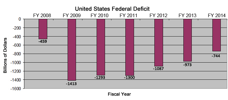
The Federal government is projected to spend $649 billion more than it has in tax revenues in FY2014, the current fiscal year. It has been deficit spending at a rate of $1.3 trillion each year from FY2009 to FY2011. In FY2012 the deficit was over $1.087 trillion and in FY2013, the deficit was $680 billion. Our debt has ballooned from $9.986 trillion in FY 2008 to $16.719 trillion in FY2013 and is expected to break the $20 trillion mark by the end of FY 2017. At some point, we will not be able to easily finance any more debt and will have to take draconian actions to survive just as Greece and Cypress have done in the recent past. Many experts agree that this catastrophe is only 5 to 7 years from now (2019 to 2021).
As you can see below, the deficit increased dramatically from FY 2008 to FY2009 from $459 billion to $1,413 billion. This is an increase of $954 billion or 208%, in essence a tripling of the deficit. The deficit has continued to be substantially over the $1 trillion level over the next 3 fiscal years. Some action has been taken in December 2012 with increased taxation and in March 2013 with sequestration cutting expenditures by $85 billion per year. This has helped. It is more than disappointing that the Congress and the President deferred any further action until after the elections in 2014. We need further dramatic action to achieve a balanced budget as soon as possible. This is imperative as the baby boomers retire and dramatically balloon Social Security, Medicare, and Medicaid expenditures over the next 30 years. It is also critical given the low interest rates with which we have been blessed. These favorable interest rates will only continue for 2 or 3 more years. Any normal interest rates will cause the interest on our national debt to skyrocket.
| FY 2008 | FY 2009 | FY 2010 | FY 2011 | FY 2012 | FY2013 | FY 2014 | |
| US Federal Budget | In billions | In billions | In billions | In billions | In billions | In billions | In billions |
| Income: |
2,524 |
2,105 |
2,163 |
2,303 |
2,450 |
2,712 |
3,034 |
| Expenses: |
2,983 |
3,518 |
3,456 |
3,603 |
3,537 |
3,685 |
3,778 |
| Loss: |
-459 |
-1,413 |
-1,293 |
-1,300 |
-1,087 |
-973 |
-744 |

This dramatic increase in the deficit from FY2008 to FY2009 was almost equally split between a huge loss of income from less tax revenue and a tremendous increase in expenditures as the second great contraction hit our economy. Please see below.
| FY 2008 | FY 2009 | Difference | Difference | Percent | |
| US Federal Budget | In billions | In billions | In billions | Percent | of Loss |
| Income: |
2,524 |
2,105 |
-419 |
-16.60% |
43.92% |
| Expenses: |
2,983 |
3,518 |
-535 |
-17.93% |
56.08% |
| Loss: |
-459 |
-1,413 |
-954 |
207.84% |
100.00% |
|
-954 |
The other question that has been asked of us most recently was what changed between OMB’s original estimated figures for FY2013 and the actual results for FY 2013 that have just been published. As you can see below, the difference was an increase in taxes of $63 billion (due to an $82 billion increase in individual incomes taxes and decreases in all other taxes) and a rather substantial decrease in expenditures of $230 billion. The decreases were across the board in general but concentrated in Defense ($27 billion), Income Security ($27 billion), Medicare ($13 billion), Commerce and Housing Credits ($101 billion), Health ($12 billion), and the catchall Education, Training, Employment and Social Services ($12 billion).
| FY 2012 | FY2012 | Difference | Difference | |
| Actual | Estimate | Percent | ||
| US Federal Budget | In billions | In billions | ||
| Income: |
2,450 |
2,469 |
-19 |
-0.77% |
| Expenses: |
3,537 |
3,796 |
259 |
6.82% |
| Loss: |
-1,087 |
-1,327 |
240 |
18.09% |
|
240 |
All figures are derived from the historical numbers found on the Office of Management and Budget website. The Office of Management and Budget is part of the Executive Branch of the US Government. The FY 2013 numbers are now final but the FY2014 figures are OMB’s current estimates and will not be finalized for some time. These figures at OMB are updated once or twice a year as budgets are assembled and the actual figures for the current year are finalized and ready for publication.
We chose to use OMB’s figures because they are available on-line, contain historical information (some going back to the founding of our country), have very robust information that contains both summary level as well as detailed level information, and are internally consistent.
Other sources such as the Congressional Budget Office update their figures more frequently (in this case quarterly). However, they focus on projections of the current budget or future budget and are less detailed and do not generally have historical data and actual data available as benchmarks for comparison.